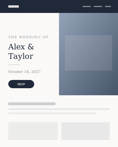
Classic Elegance
FeaturedFormal and editorial — a split cover that feels like an invitation.
ten, on purpose
Other builders hand you three hundred templates and call the scrolling "fun." VowSite ships ten considered styles — each with a distinct hero and header, plus interchangeable section layouts you can mix after you start. Colors stay yours. Buttons and forms keep working the same way no matter which layout you pick.
Formal and editorial — a split cover that feels like an invitation.
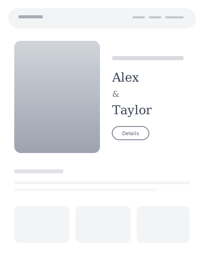
Quiet, airy, and considered — room for your photos to breathe.
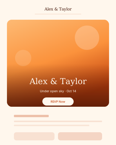
Warm outdoor light with a bottom-pinned welcome.
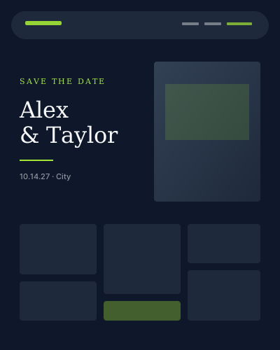
Dark and graphic — magazine energy for photo-first couples.
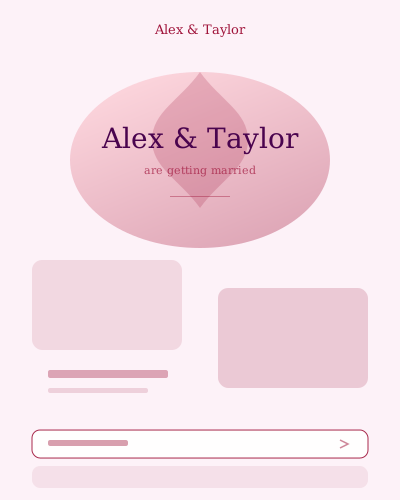
Soft florals and ornament — romantic without feeling fussy.
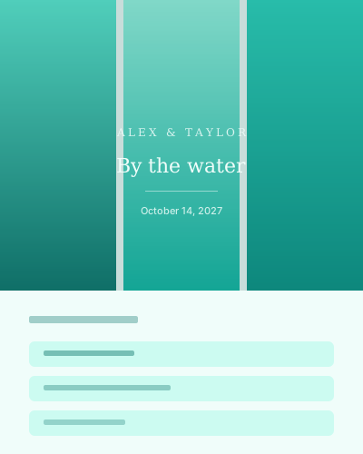
Teal water-light strips and a breezy day-of list.
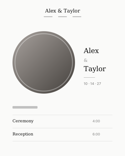
Black, ivory, and a circular portrait — spare and typographic.
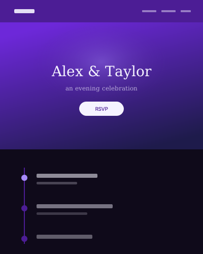
Evening contrast — violet dark with an overlay welcome.
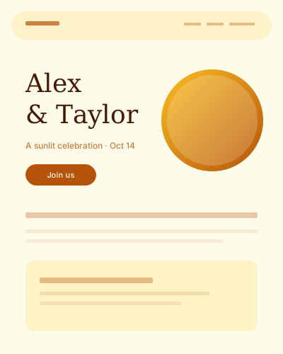
Golden daylight and bold names — studio-bright and warm.
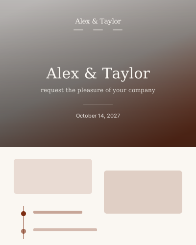
Full-bleed welcome with centered brand — classic keepsake energy.
Every style is themed per couple: pick your primary and accent colors and the whole site — buttons, focus states, table QR codes, even the print pieces — follows. Choose from curated font pairings, reorder sections, and write your story with the AI assistant if the blank page stares back. Two couples on the same template never look like each other.
See one live: tour the demo wedding site — RSVP flow, registry, and all.